Mr. Tredinnick's Class Site
  • Home
  • Geography Courses
    • AP GIS&T
    • AP Human Geography
    • Biogeography >
      • Biogeography Forum
    • Cartography
    • Ecological Biogeography >
      • Ecological Biogeography Forum
    • GEOG 1020 - Human Geography
    • GEOG 1030 - Physical Geography
    • GEOG 4100/8106 - Biogeography
    • GEOG 8040 - Seminar in Geography Education
    • Geographic Information Systems (GIS)
    • Global Studies >
      • Global Studies Forum
    • Human Geography (Rubenstein)
    • Human Geography (Tredinnick)
    • International Relations: World Environmentalism Focus >
      • International Relations: World Environmentalism Forum
    • World Geography
  • History Courses
    • AP European History >
      • AP Euro Forum
      • AP European History 2013-2014
    • AP World History
    • Art History
    • Minnesota History
    • United States History
    • World History (Fall Semester)
    • World History (Spring Semester)
    • World History Summer Session
  • Political Science Courses
    • AP Comparative Government >
      • AP Comparative Government Forum
    • AP U.S. Government >
      • AP U.S. Government Forum
    • Environmental Policy >
      • Environmental Policy Forum
    • International Relations
    • U.S. Government >
      • US Government Forum
  • Elective Courses
    • Behavioral Science >
      • Behavioral Science Forum
      • Social Science >
        • Social Science Forum
    • Economics
    • Psychology >
      • Psychology Forum
    • Sociology >
      • Sociology Forum
    • Zoo Operations: Conservation Geography
  • About

Forum 1.8 - A Spatial Impact

1/2/2022

20 Comments

 
Guiding Thought Question: Conduct a web search to find a map that displays one one of the ways in which humans are having a positive or negative affect on the environment. Once you have found your map copy and paste the answer template below into your response and complete it for your map. Obviously take out the blank spaces and write in your own answers. Include as many of the prompted areas below as possible.

The title of the map I found is ____________________
I found this map at ________________(insert link)
This map was made in __________________
_______________ made this map
The relationship that my map shows is that _________________
The data used to make this map came from ____________________________
I know this map is reputable because ___________________

Guiding Inquiry: How have humans impacted the environment and been affected by it?

Today's Learning Objective: Students will examine the impact humans have had on the environment by completing a map-quest in which they will need to identify an authoritative map and explain the spatial relationship it represents. They will then further understand thee ways that humans adapt to their environment, impact the environment, and are a reflection of the physical environment by completing a map analysis activity as notes.(3.5.a, 3.5.b, 3.5.c)
Picture
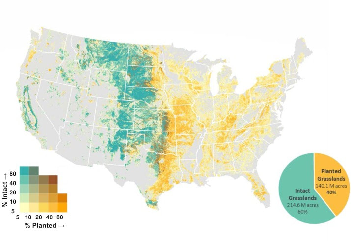
Protecting our prairies: Research and policy actions for conserving America’s grasslands
20 Comments
Bob
1/31/2022 09:01:58 am

Title: Map of CO2 for USA
Found at: https://scitechdaily.com/scientist-maps-co2-emissions-for-entire-us/
Map made in 2020
Professor Kevin Gurney of Northern Arizona University made this map
The relation that my map shows in the amount of CO2 released into the atmosphere
Data came from Vulcan Project, that quantifies and visualizes greenhouse gases emitted across the entire country down to individual power plants, neighborhoods and roadways, identifying problem areas and enabling better decisions about where to cut emissions most effectively.
I know its reliable because it looks fine

Reply
emma
1/31/2022 09:04:02 am

Global Forest Watch
https://www.globalforestwatch.org/map/
the map is frequently updated and was made by the Global Forest Watch Organization.
This map shows the relationship between humans and deforestation.
The data comes from the organization that made the map.
I know this map is reputable because it was created by a trustable organization.

Reply
Sienna
1/31/2022 09:05:03 am

The title of the map I found is Global Distribution of Dryland Subtypes Based on the Aridity Index. I found this map at https://www.carbonbrief.org/explainer-desertification-and-the-role-of-climate-change
This map was made in 2019, by Robert McSweeney. The relationship that my map shows the distribution of drylands based on their aridity. I don't know where the data for this map came from, and I am not sure if this map is reputable.

Reply
Emily
1/31/2022 09:08:36 am

https://www.iucn.org/sites/dev/files/styles/graphics/public/content/images/global_map_of_pas_wcmc_2016.jpg?itok=uY3qxTWI

Title- Protected Areas of the World

Found at- https://www.iucn.org/theme/protected-areas/about

Made in 2016

Made by IUCN, UNEP-WCMC, WDPA

The relationship shown is land protected by humans versus nonprotected land

Data collected World Database on Protected Areas

I know this map is reputable because its made by respected environmental organizations whose main goals are conservation and protecting the environment

Reply
Peter Sukstorf
1/31/2022 09:12:43 am

The title of the map I found is Find beaches and other coastal areas fouled by plastic on this map
I found this map at https://www.openoceans.org/trash-map
This map was made in arcgis
OpenOceansGlobal made this map
The relationship that my map shows is that only a few countries contribute most of the global ocean trash.
The data used to make this map came from science nerds
I know this map is reputable because it's good

Reply
Bea
1/31/2022 09:13:41 am

The title of the map I found is AIRS Mid Tropospheric CO2 (ppm)
I found this map https://climate.nasa.gov/vital-signs/carbon-dioxide/
This map was made in 2016
NASA made this map
The relationship that my map shows is that tropospheric CO2 levels have been increasing since 2002.
The data used to make this map came from https://climate.nasa.gov/vital-signs/carbon-dioxide/
I know this map is reputable because it comes from NASA, a trusted government source. It also gives the data source

Reply
Annie
1/31/2022 09:14:04 am

The title of the map I found is ___________carbon dioxide __in thr Mid-Troposhere _in July 2009 ____
I found this map at _______ https://www.google.com/url?sa=i&url=https%3A%2F%2F19january2017snapshot.epa.gov%2Fclimatechange%2Fendangerment-and-cause-or-contribute-findings-greenhouse-gases-under-clean-air-act-1&psig=AOvVaw1Ld44ofuv4zUaj-nUwhSUR&ust=1643727799075000&source=images&cd=vfe&ved=0CAgQjRxqFwoTCOCxosGh3PUCFQAAAAAdAAAAABAK_________(insert link)
This map was made in _______2009___________
_______US environmental protective agency ________ made this map
The relationship that my map shows is that ________rising co2 levels _________
The data used to make this map came from _________________ US environmental protective agency ___________
I know this map is reputable because ___________ US environmental protective agency … I don’t think it’s that repubale because it’s from 2009 ________

Reply
mr. todd
2/1/2022 12:26:11 pm

I have some pies

Reply
Caden
2/1/2022 12:26:45 pm

Title: Map of CO2 for USA
Found at: https://scitechdaily.com/scientist-maps-co2-emissions-for-entire-us/
Map made in 2020
Professor Kevin Gurney of Northern Arizona University made this map
The relation that my map shows in the amount of CO2 released into the atmosphere
Data came from Vulcan Project, that quantifies and visualizes greenhouse gases emitted across the entire country down to individual power plants, neighborhoods and roadways, identifying problem areas and enabling better decisions about where to cut emissions most effectively.
I know its reliable because it looks fine

Reply
izzy !
2/1/2022 12:30:07 pm

https://www.globalforestwatch.org/map

The title of the map I found is 30 Years of Deforestation and Forest Growth, by Country
I found this map at https://www.visualcapitalist.com/mapped-30-years-of-deforestation-and-forest-growth-by-country/
Niccolò Conte from Visual Capitalist made this map
The relationship that my map shows is that Forest Growth/Deforestation in the past 30 years by country
The data used to make this map came from Food and Agriculture Organization of the United Nations
I know this map is reputable because the data is from the UN, who seem decently trustworthy. But ultimately, who knows!

Reply
izzy
2/1/2022 12:36:50 pm

https://www.visualcapitalist.com/mapped-30-years-of-deforestation-and-forest-growth-by-country/

Reply
Cariena
2/1/2022 12:32:46 pm

The title of the map I found is Deaths From Climate Change
I found this map at https://www.who.int/heli/risks/climate/climatechange/en/
This map was made in 2002
WHO made this map
The relationship that my map shows is that as climate change worsens more people are dying
The data used to make this map came from the world health report of 2002
I know this map is reputable because WHO warned us about covid so I trust them. (also they are a legit organization)

Reply
Ella link
2/1/2022 12:35:02 pm

title: Map of U.S. Dams Removed Since 1912
found: https://www.americanrivers.org/threats-solutions/restoring-damaged-rivers/dam-removal-map/
made in google earth
shows the amount of dam removals since 1912
data from historical records
probably reliable since its a trustworthy organization.

Reply
little forget link
2/1/2022 12:38:07 pm

The title of the map I found is _Mapping the other 70% percent__

I found this map at _https://external-content.duckduckgo.com/iu/?u=https%3A%2F%2Fwww.markmeynell.net%2Fwp-content%2Fuploads%2F2008%2F02%2Foceans-human-impact.jpg&f=1&nofb=1

This map was made in ___Quaerentia_____

_Mark Meynell___ made this map

The relationship that my map shows is the __Human direct influences on the oceans__

The data used to make this map came from ____https://www.markmeynell.net____

I know this map is reputable because _one of it's sources is the national center for ecological analysis and synthesis. ______

Reply
Chloe
2/1/2022 12:42:01 pm

Title - Arctic Sea Ice Decline
Founds at - https://www.globalchange.gov/sites/globalchange/files/styles/resource_image/http/data.globalchange.gov/assets/0d/3d/85f596ea63dcc54ad38ee10b6d7c/APP_arctic_sea_ice_V6.png?itok=LqkFJC8g
Map Made in - 2012
Creator - University of Illinois
This map shows the concentration of sea ice from the years 1992 & 2012, & the % lost within that timespan.
Data Source - National Snow and Ice Data Center
This map is reputable because the source of its data is trustworthy, & the website it is on is a .gov website about global climate change.

Reply
Braeden Irwin
2/1/2022 12:46:52 pm

Title: Global Map of Tree Cover Losses and Gains
Found at: https://www.researchgate.net/figure/Global-map-of-tree-cover-losses-and-gains-generated-from-a-time-series-analysis-of-654_fig1_285647113
This map was made in no idea
Richard A Houghton made this map
This is the relation between humans and forest gain/loss
The data used to make this map came from a research project
This map seems to be reputable because the person credited for making this map has extensive reviews, and went to a reputable university. Though more research into him would be necessary

Reply
Riley Martin
2/1/2022 12:47:01 pm

The title of the map I found is "Using the IUCN Red List to map threats to terrestrial vertebrates at global scale"
I found this map at (https://www.nature.com/articles/s41559-021-01542-9)
This map was made in 2020
Nature Ecology and Evolution made this map
The relationship that my map shows is the different impacts on various animal species and how much each effects them.
The data used to make this map came from the IUCN Red List
I know this map is reputable because the it is very recent and uses very reliable information

Reply
emma
2/1/2022 12:48:08 pm

river plastic emmisions to the worlds oceans
i found this map at https://www.google.com/search?q=plastic+pollution+map+2022&tbm=isch&ved=2ahUKEwjW4eWDj9_1AhUJAs0KHSz-BWsQ2-cCegQIABAA&oq=plastic+pollution+map+2022&gs_lcp=CgNpbWcQAzoECAAQQzoFCAAQgAQ6BggAEAcQHjoGCAAQCBAeOgQIABAeOgYIABAFEB5QqQZYhBZgwh5oAHAAeACAAW6IAfQEkgEDMS41mAEAoAEBqgELZ3dzLXdpei1pbWfAAQE&sclient=img&ei=pnn5Ydb2EImEtAas_JfYBg&bih=702&biw=1517&rlz=1CAICRP_enUS916&safe=active&ssui=on#imgrc=GuPrT0Kg7alfpM
this map was made in 2017
laurent c m lebreton
the relationship is the plastic in certain areas around the world
its from nature communications so no i dont think so because it was made in 2017 so not the closest time

Reply
Daniel
2/1/2022 12:49:14 pm

The title of the map I found is _How’s my Waterway_
I found this map at __ https://mywaterway.epa.gov/community/68108/drinking-water_(insert link)
This map was made in ______
_the United States environmental protection agency __ made this map
The relationship that my map shows is that __water quality _______
The data used to make this map came from _________ multiple databases at EPA___________
I know this map is reputable because __from government datebase________

Reply
Maria
2/1/2022 12:49:20 pm

The title of the map I found is Annual change in forest area as a share of forest area, 2015
I found this map at https://ourworldindata.org/grapher/change-forest-area-share-total?country=~CHN
This map was made in
Our World in Data made this map
The relationship that my map shows is deforestation and afforestation average in each country
The data used to make this map came from UN Food and Agriculture Organization (FAO), Forest Resources Assessment 2020, UN FAO Forest Resources Assessment.
I know this map is reputable because of the sourcing data.

Reply


Leave a Reply.

    Ecological Biogeography Forum

    Welcome to the Forum! Here is where you will be answering your daily warm-up questions. Please do not enter your last name for privacy reasons, and you may use a nickname if you would like (Just make sure Mr. Tredinnick is aware of the nickname you are using). Write out thoughtful responses to the forums on the days they are assigned. If you miss a day please take it upon yourself to complete the Forum you missed. Each Forum has the targeted Learning Objective(s) there so you can see what the focus of the day's class will be.

    Archives

    March 2022
    January 2022
    November 2021
    May 2021
    February 2020
    May 2019
    April 2019
    March 2019
    February 2019
    January 2019

    Categories

    All

    RSS Feed

Picture

Home

Picture

Geography for Geographers

Picture

Geopolaris Education Publications

Email: GeoKTred@gmail.com
Site Created and Maintained by Kyle Tredinnick 2010-2022